Truffledust
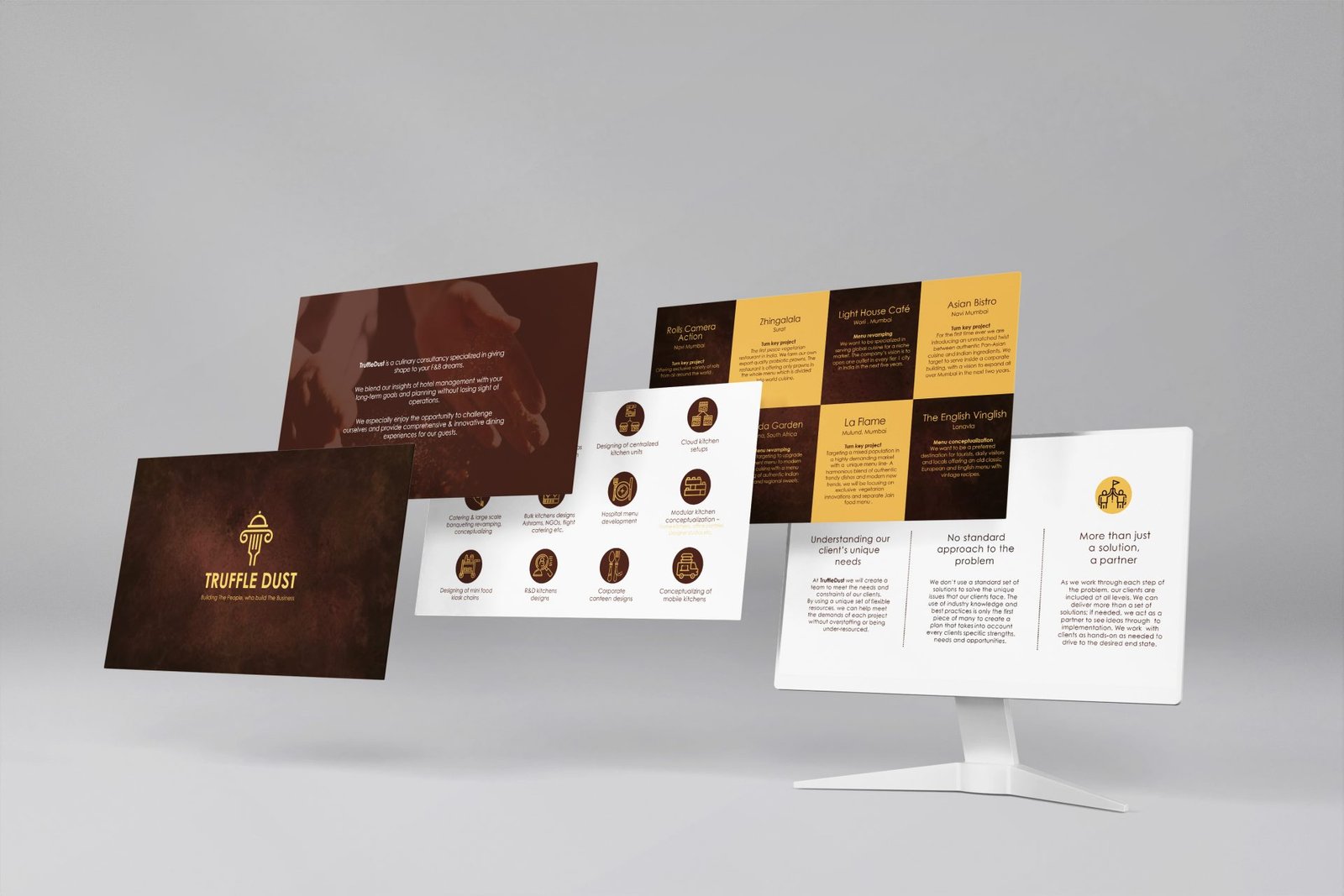
TruffleDust is a culinary consultancy specialized in giving shape to F&B dreams.
Here, insights of hotel management are blended with clients’ long-term goals and planning without losing sight of operations. The right talent for the right role is identified and polished before fitting into the right F&B business.
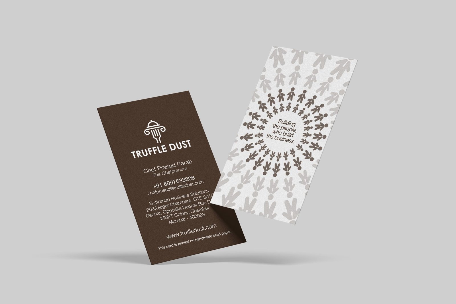
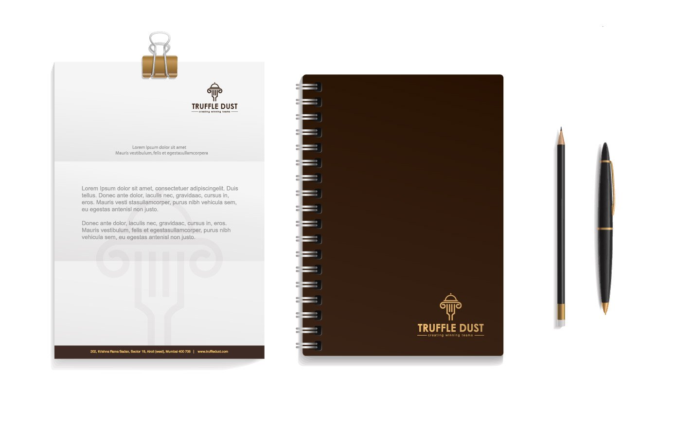
The logo features a stylised fork topped by a cloche- the entire shape resembles a pillar with a corinthian top, representative of our experience and strong foundation in the culinary skills. On the card we see an extension of this thought with a mesh of people and the tagline ‘building the people who build the business’. The simple colour scheme comes from the colour of truffles and establishes transparency and trust. This was further augmented by a chrome yellow in the slide deck prepared for introducing the brand to prospective clients.
