Tura Supreme
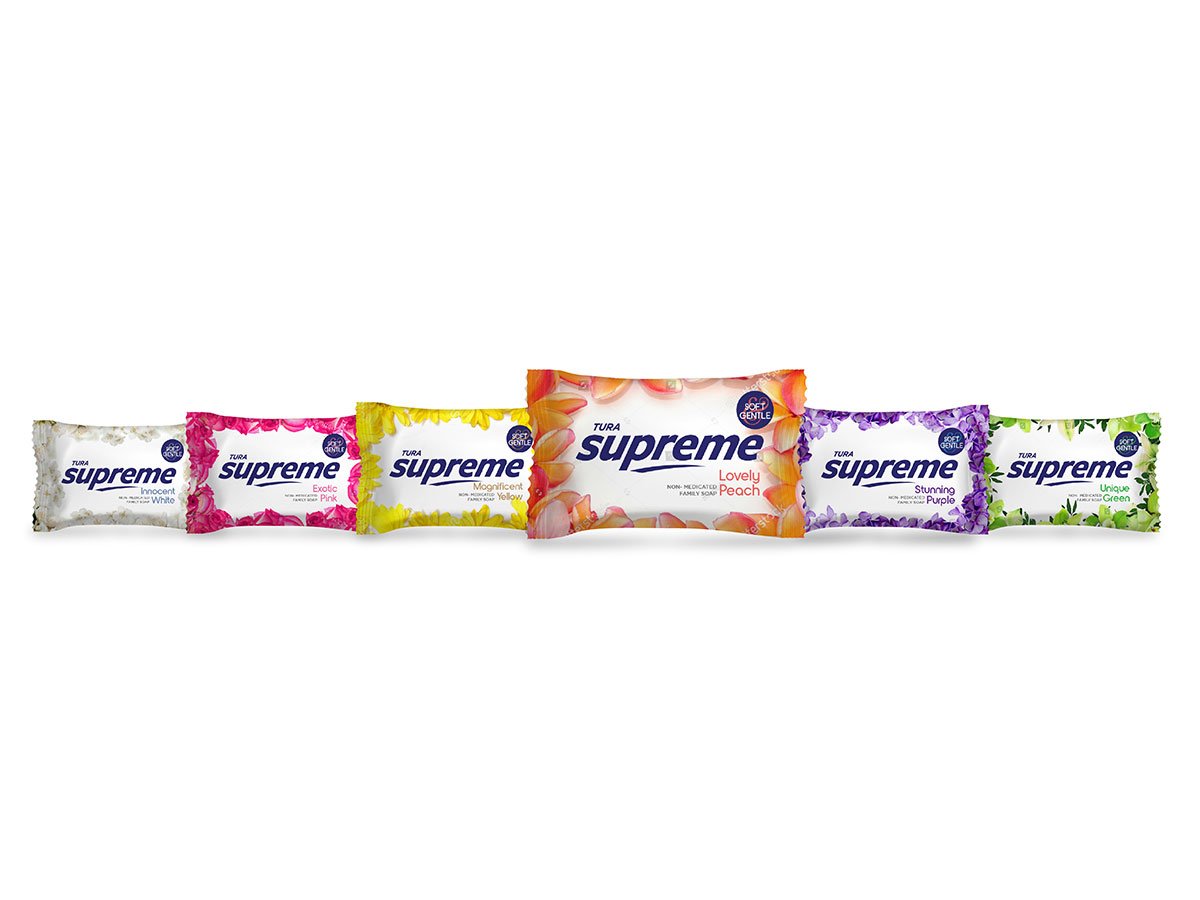
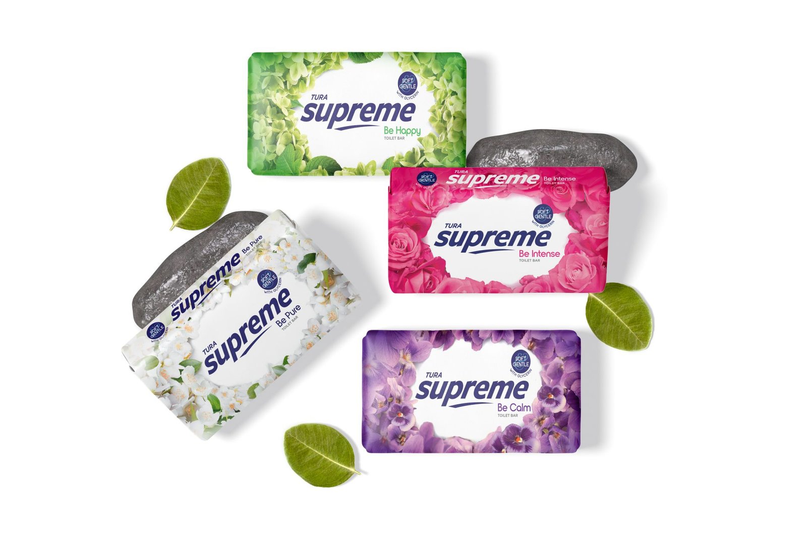
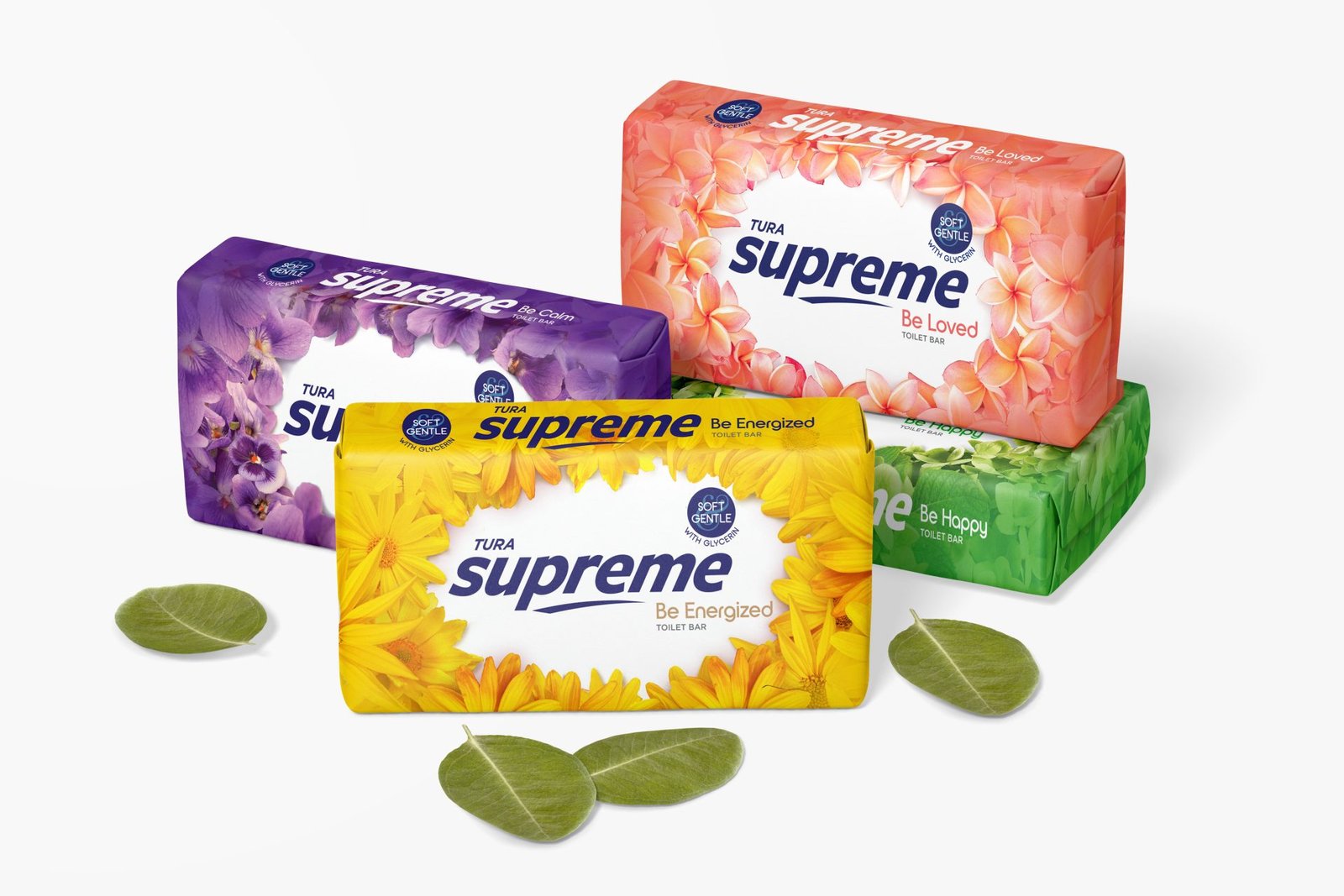
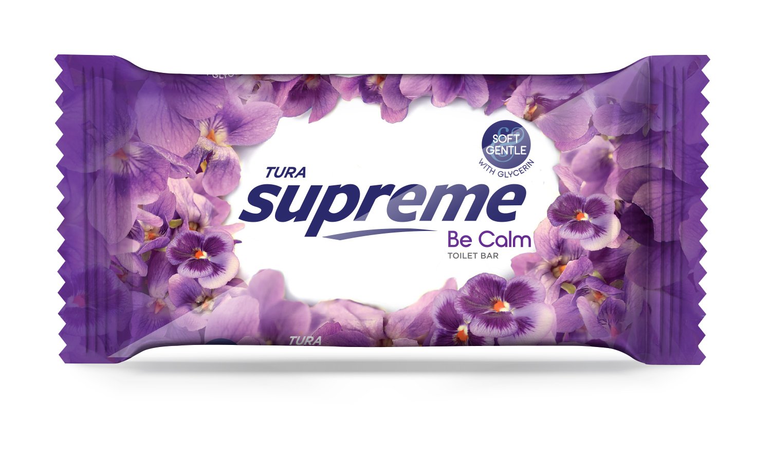
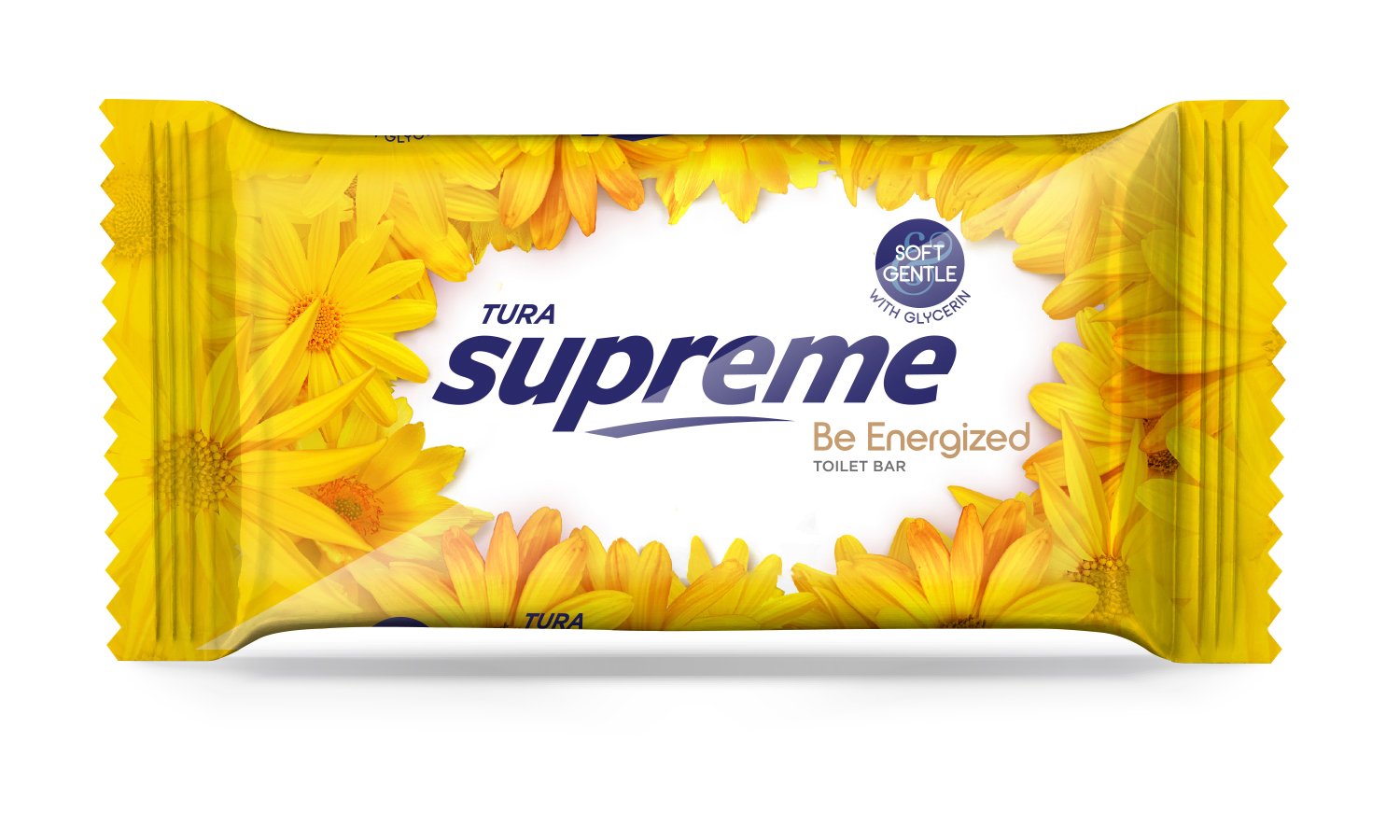
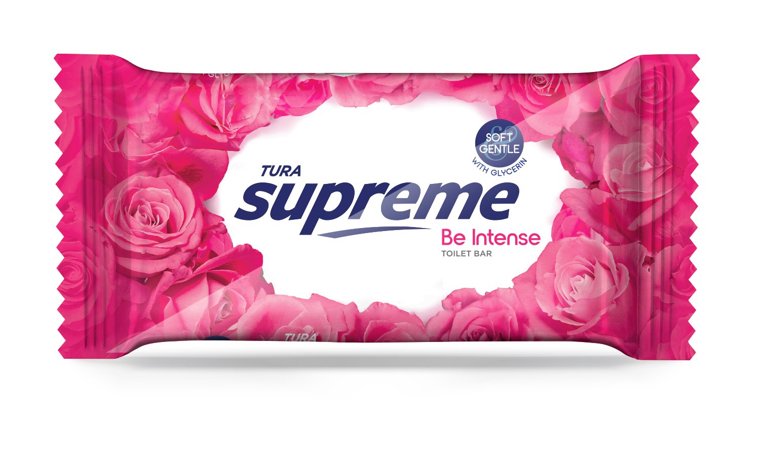
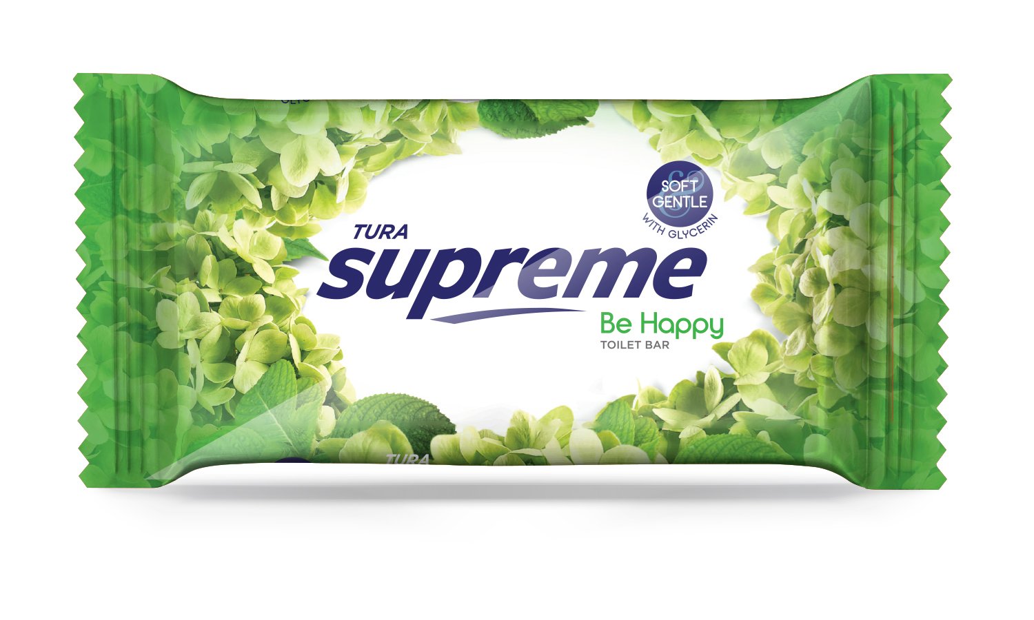
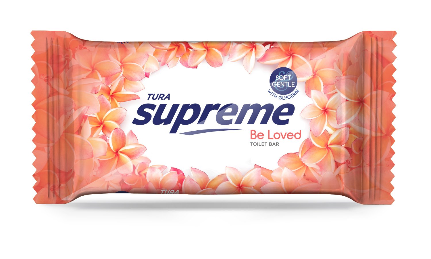
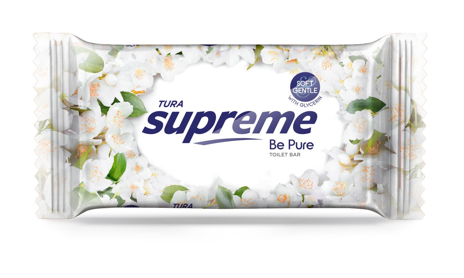
Tura is a brand from Nigeria owned by the Godrej group. As a first step toward a packaging overhaul, we redesigned the Supreme branding, taking it from a weak typographical form to a bold one. The italicised font style was retained, as was the swash.
For their family soap called ‘Supreme’, the client wanted a complete packaging rework to beat the competition, and in keeping with the market demand. All the soap variants are floral scents, so it was logical to base the packaging around the scents, as compared to the previous differentiation based only on colour. The result was this family of pack designs, each with its distinct colour and floral representation, which ties up beautifully as a range.
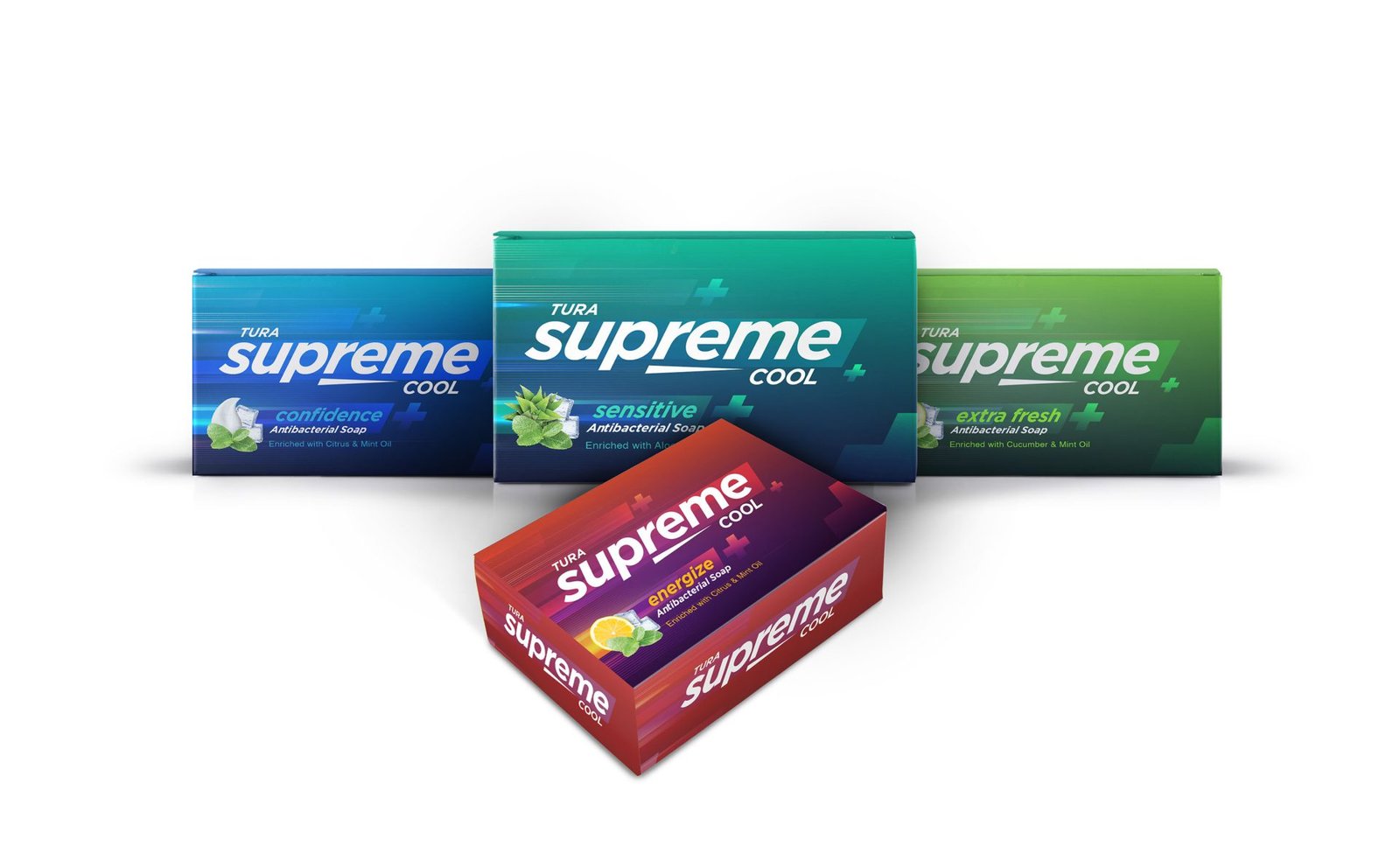
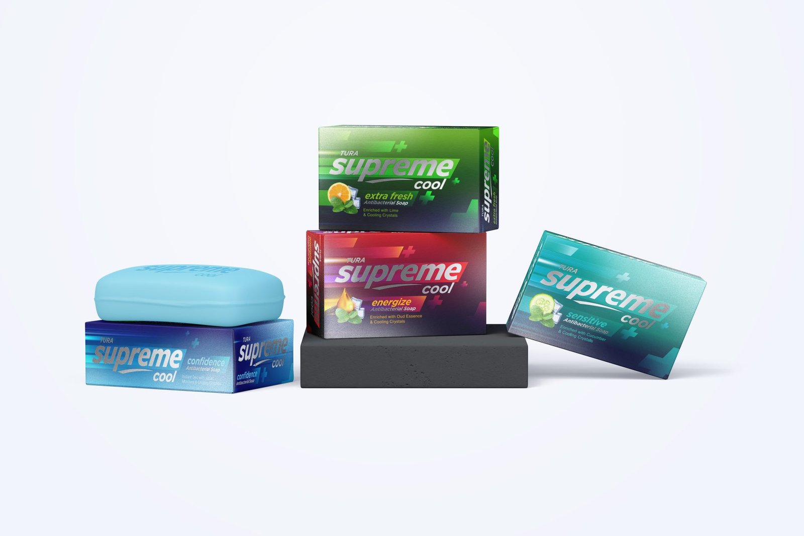
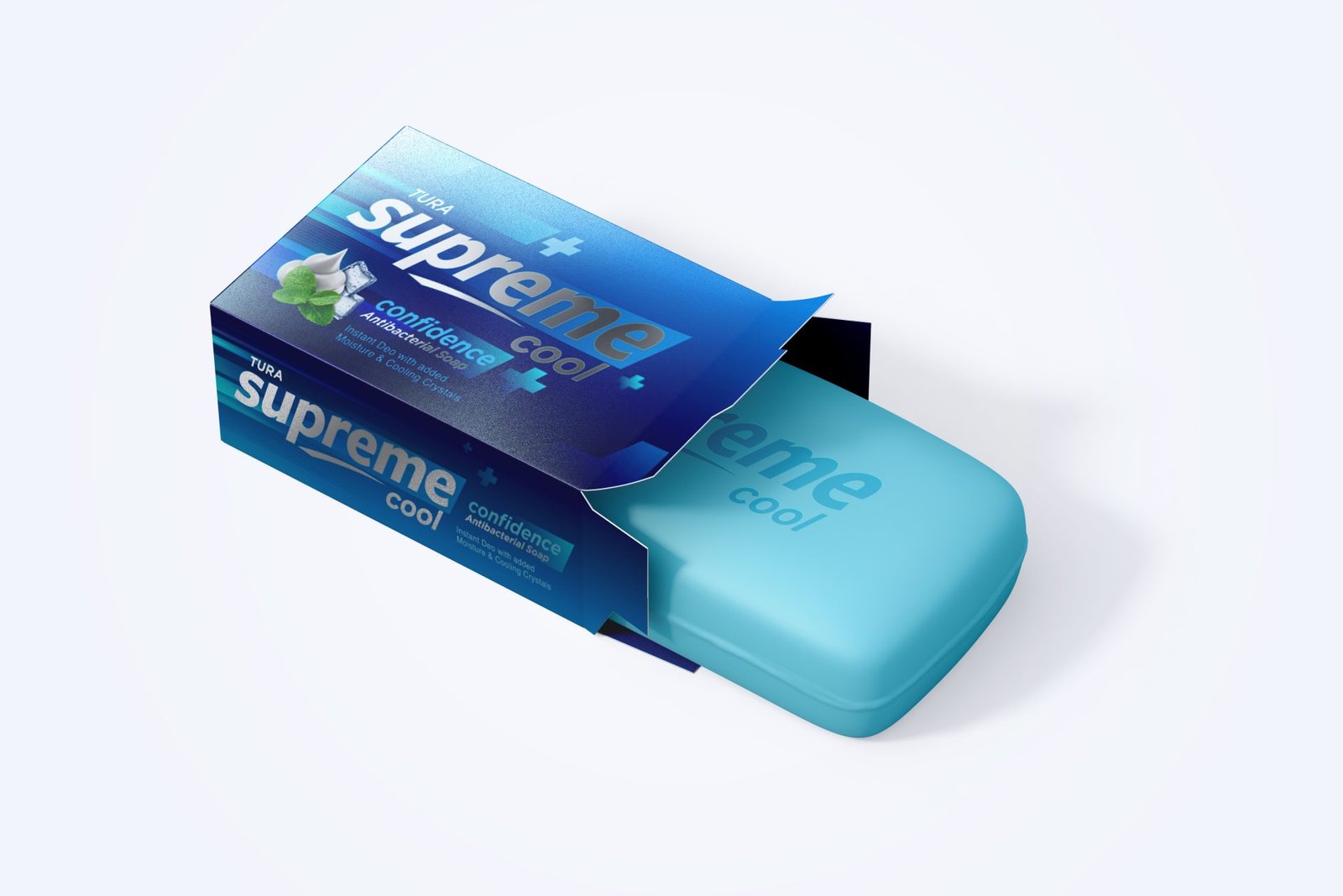
For their Sports variant titled ‘Cool’ thanks to the presence of cooling menthol, we went to a different route. This soap comes packaged in a metallic carton, which bear different colours on the cool spectrum. The background graphics bear soft medical cross signs, as a subtle reminder of the medicated nature of the product, and the ingredients find a small dedicated space just under the brand name, emphasizing the freshness of ingredients.
